Cody website
UI design . UX design
Cody is an online interactive website for learning to code. Cody offers free courses in 14 programming languages like javaScript, Python and C++.
Overview
The problem
Learning to code is hard, especially for people with full-time jobs who didn't major in computer science, and can't afford to go back to school to study.
The goal
Design a website that makes learning to code easy and fun for everyone without prior computer science knowledge.
Responsibilities
Conducting interviews and making surveys, paper and digital wireframing, low and high-fidelity prototyping, conducting usability studies, accounting for accessibility, and iterating on designs.
My role
UX/UI designer designing an app from concept to delivery.
Project duration
September 2021 to November 2021
Understanding the user
User research
I conducted user interviews and used surveys to better understand the target users and their needs. I discovered that many target users quit learning to code after a short period of time, because they find coding hard and complicated, while other users don’t even start their path of learning due to their busy schedules.
User pain points
1. Experience: Other learning websites don’t provide an engaging fun way of learning.
2. Time: Other learning websites offer long and complicated courses that people with busy schedules can’t finish.
Persona & problem statement
Nina is a busy employee, who needs an engaging and easy way to learn to code Because she wants to become a programmer.
.png?h=adceed276cde0e2416ed835b03173130)
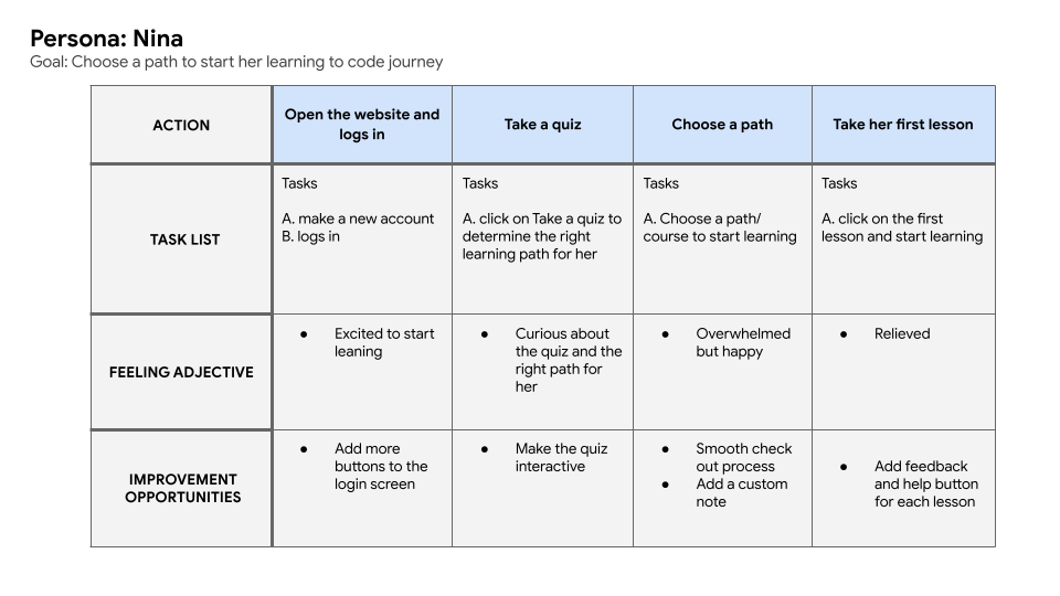
User journey map
I created a user journey map of Nina’s experience using the website to help identify possible pain points and improvement opportunities.
Starting the design
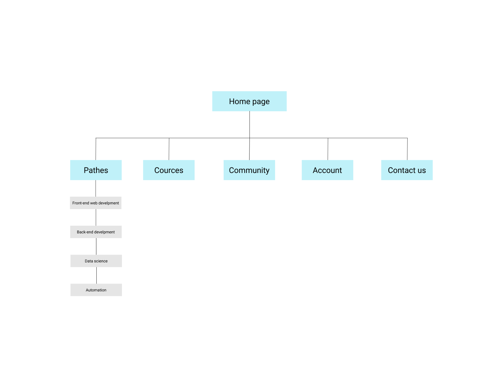
SiteMap
The structure I chose was designed to make things simple and easy.
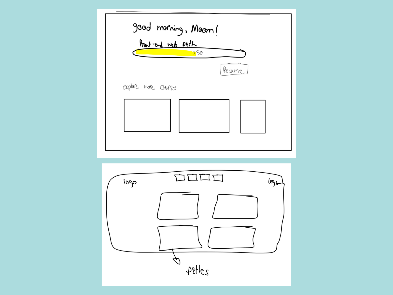
Paper wireframes
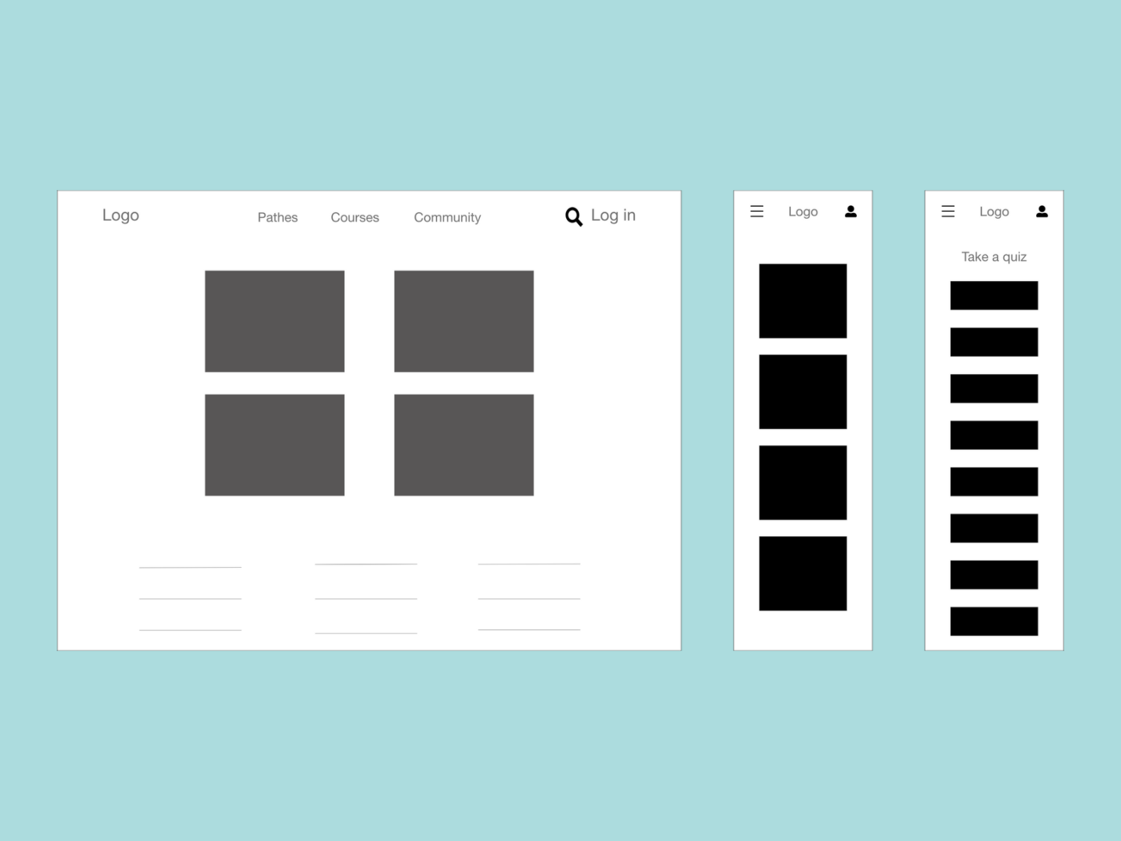
Digital wireframes
I tried to make a design that help addressing the user pain points and improve the user experience.

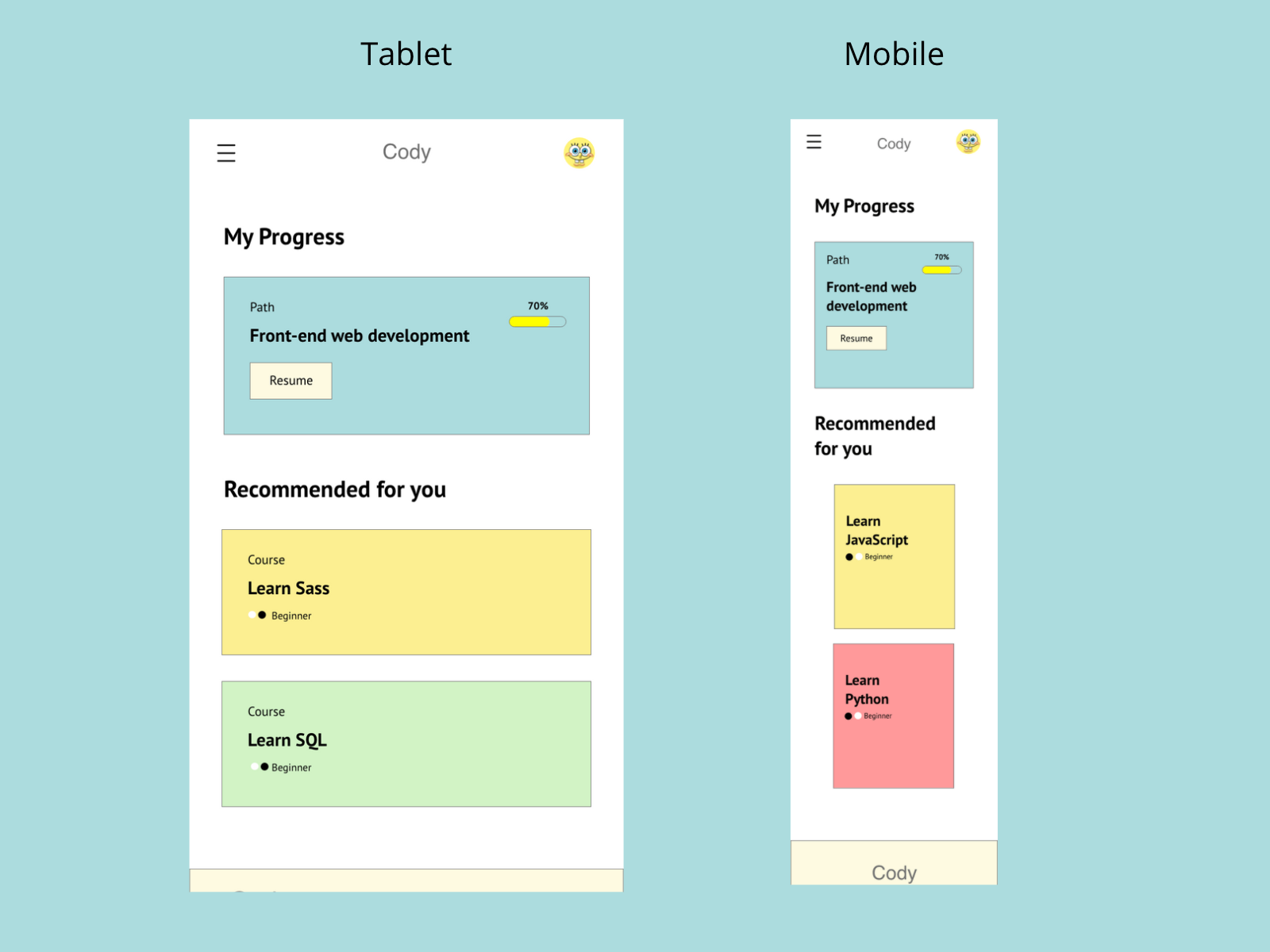
Digital wireframe screen size variation(s)
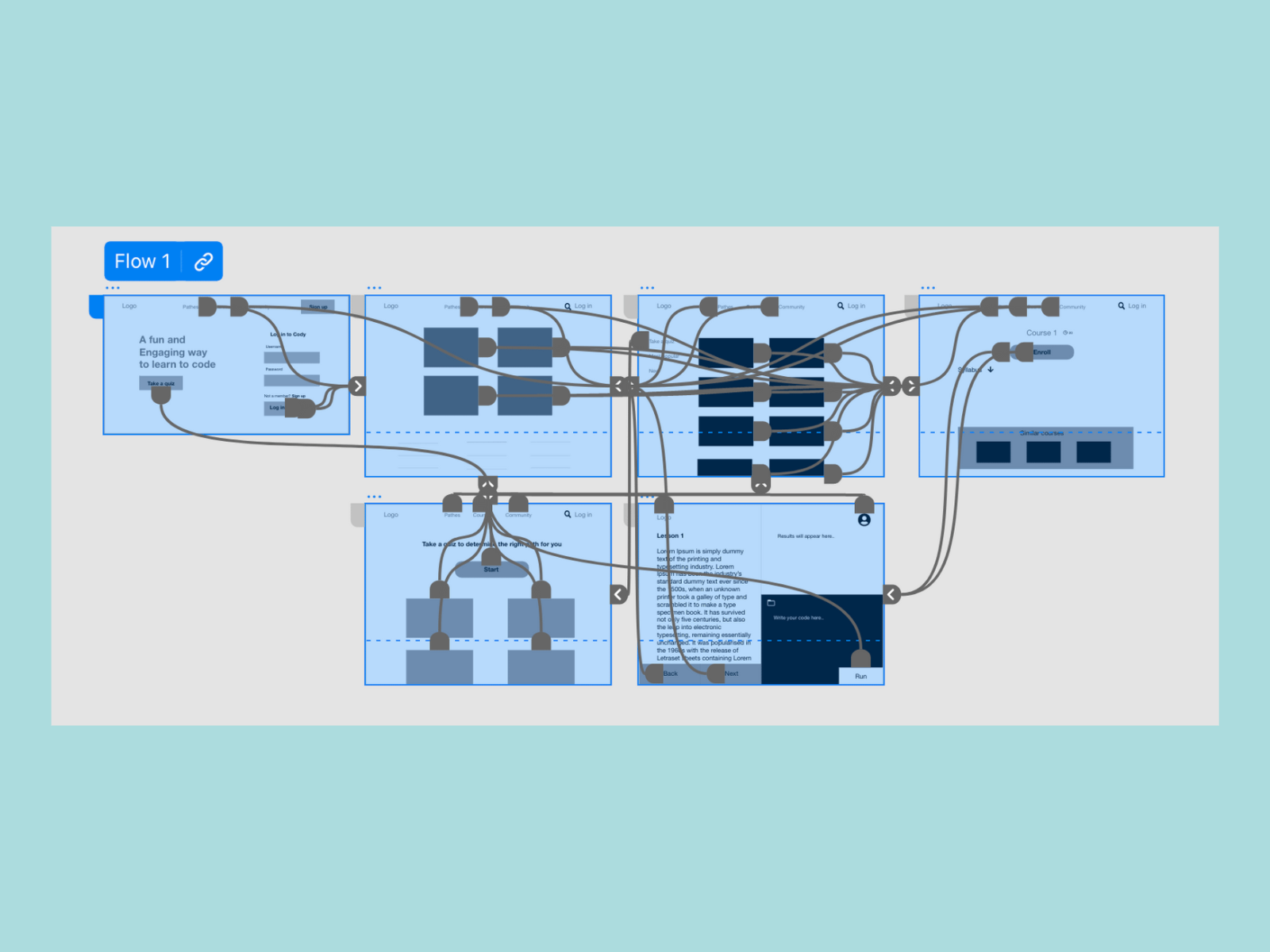
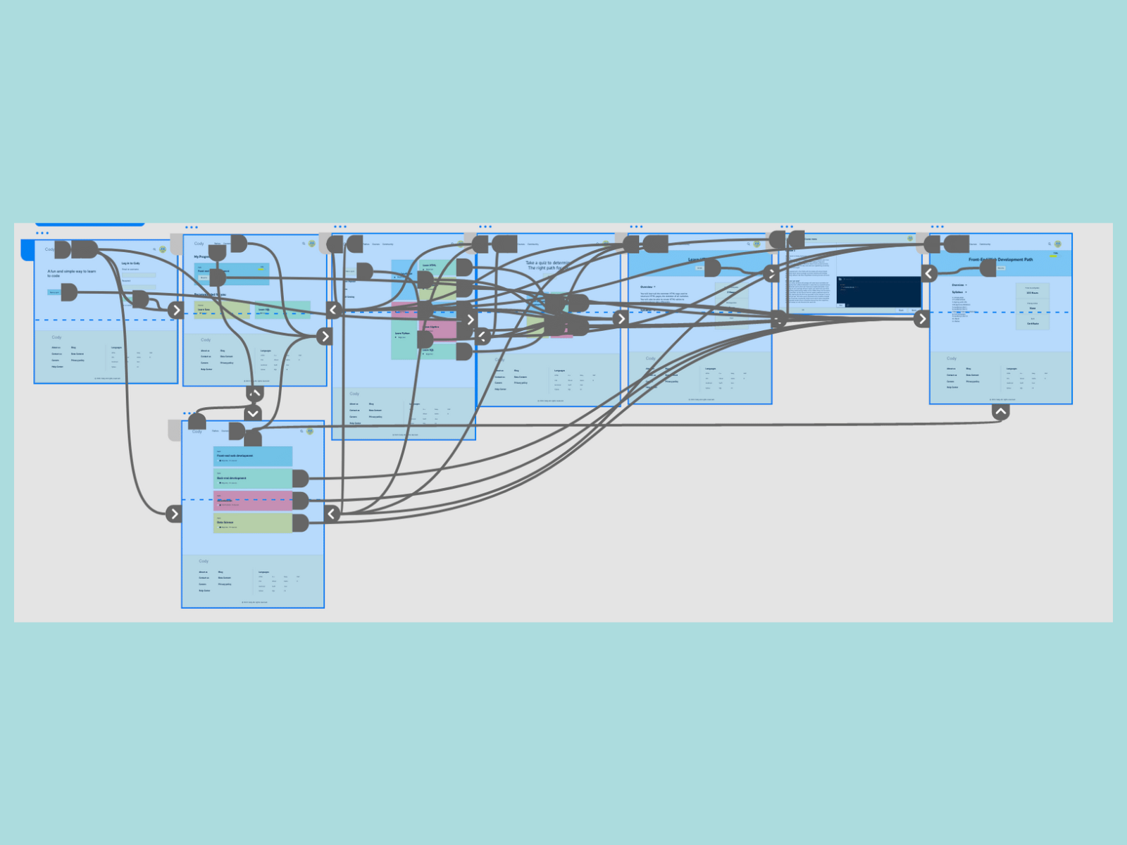
Low-fidelity prototype
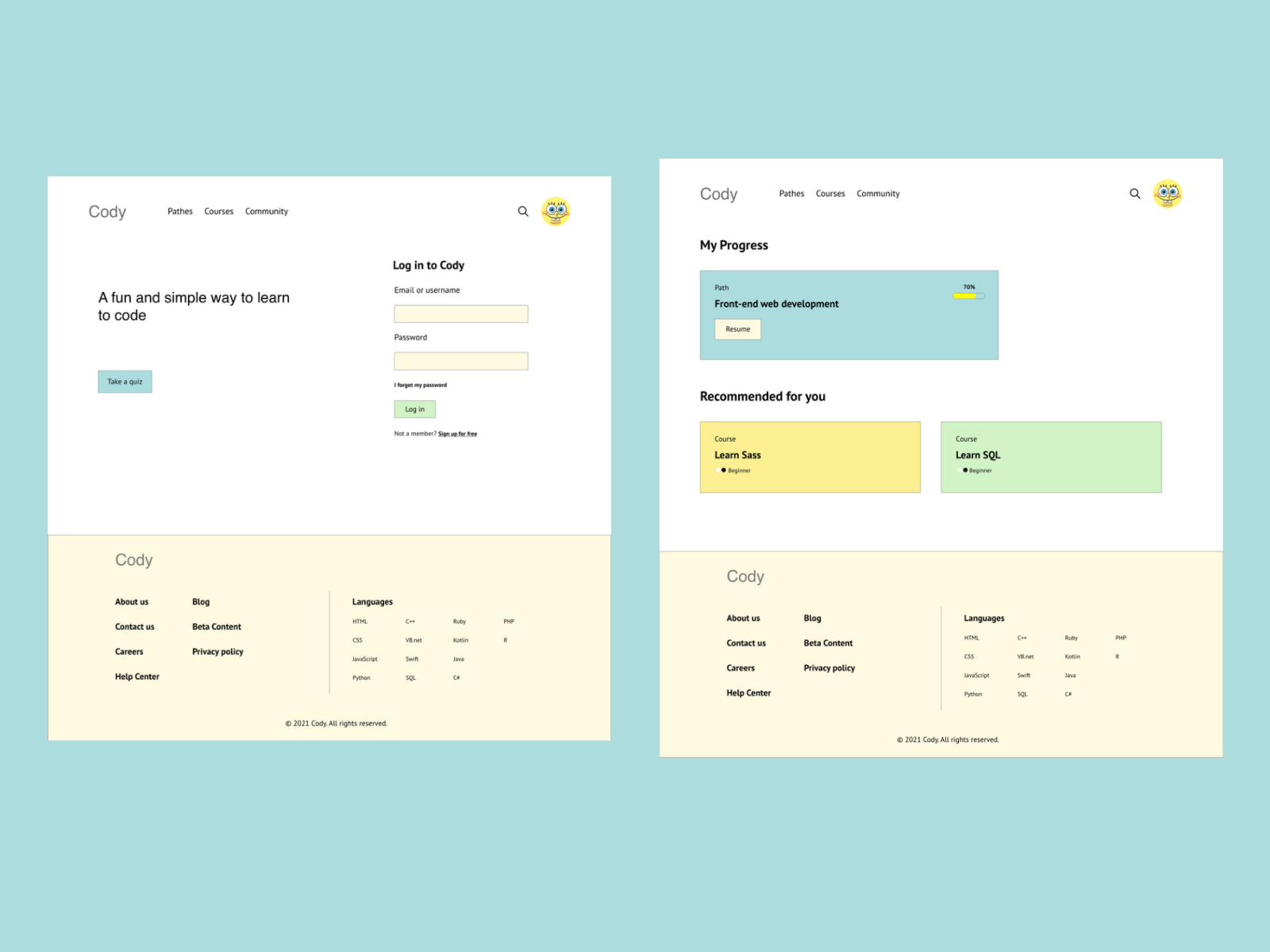
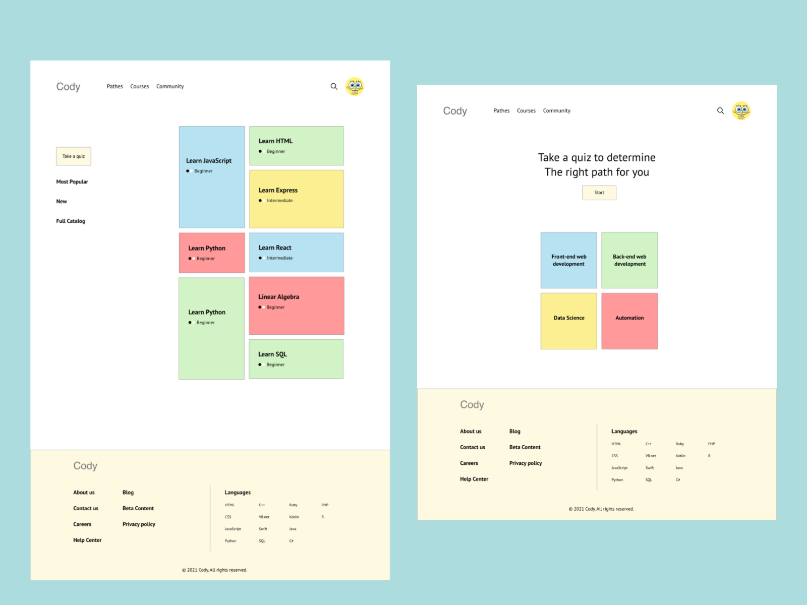
I connected all of the screens involved in the primary user flow of logging in, to taking a quiz to start learning.
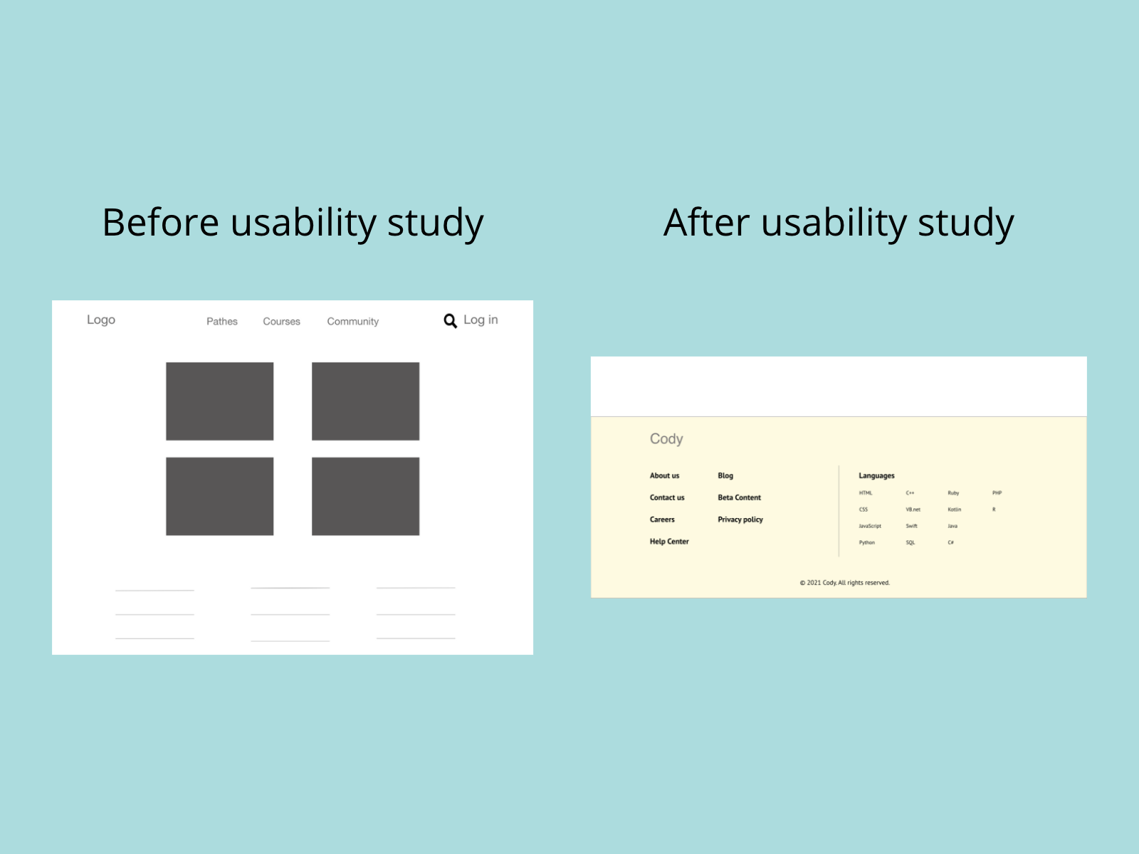
Usability study findings
The low-fidelity prototype was used in an unmoderated usability study with 5 participants. Here are the main findings uncovered by the usability study
1. Information: Users didn’t understand what each path/course is about.
2. Prerequisites: User didn’t know what are the Prerequisites for each course.
3. Languages: User wanted a way to choose a programming language to learn.
Refining the design
Mockups
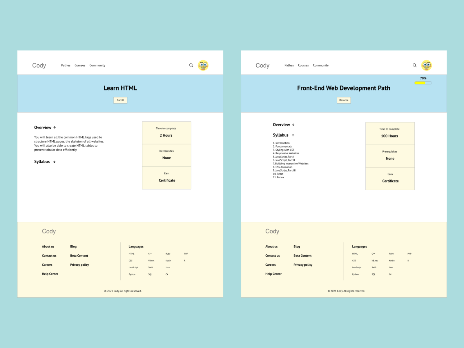
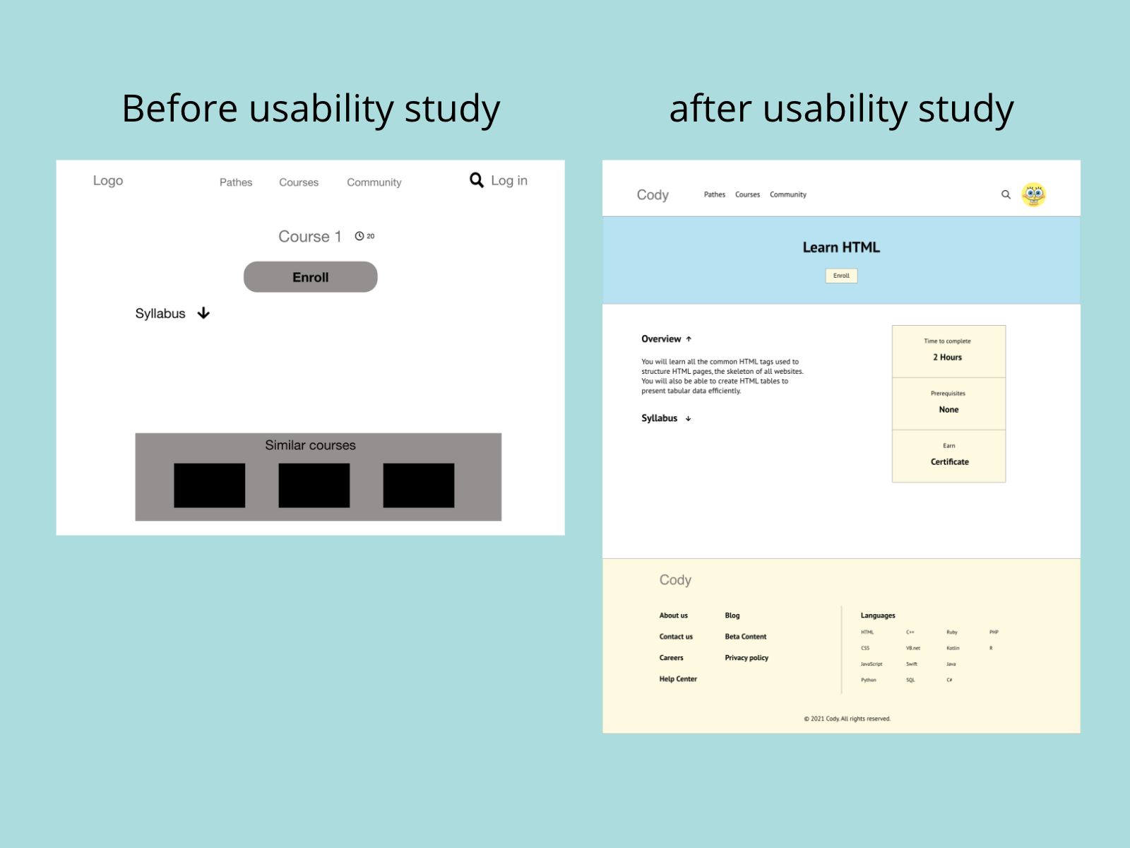
Based on the insights from the usability study, I made changes to improve the course page.
Based on the insights from the usability study, I made changes to improve the website footer.
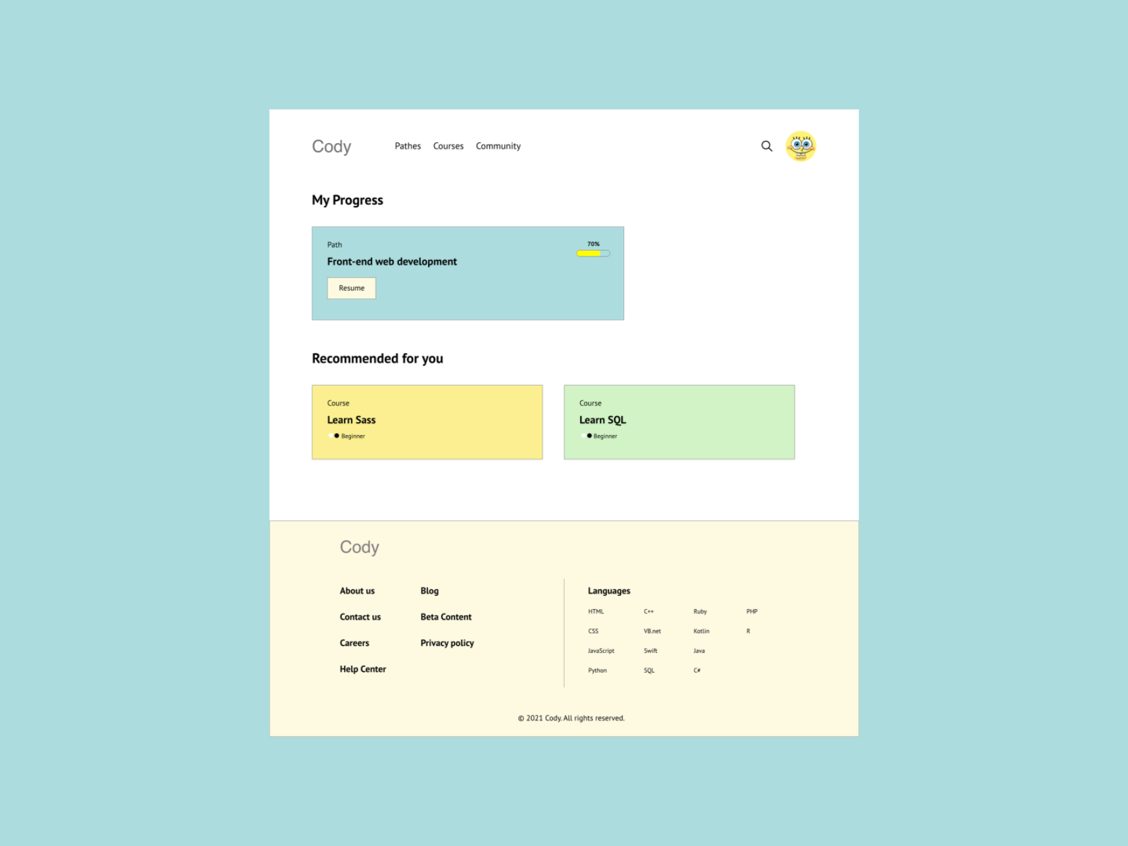
High-fidelity Prototype
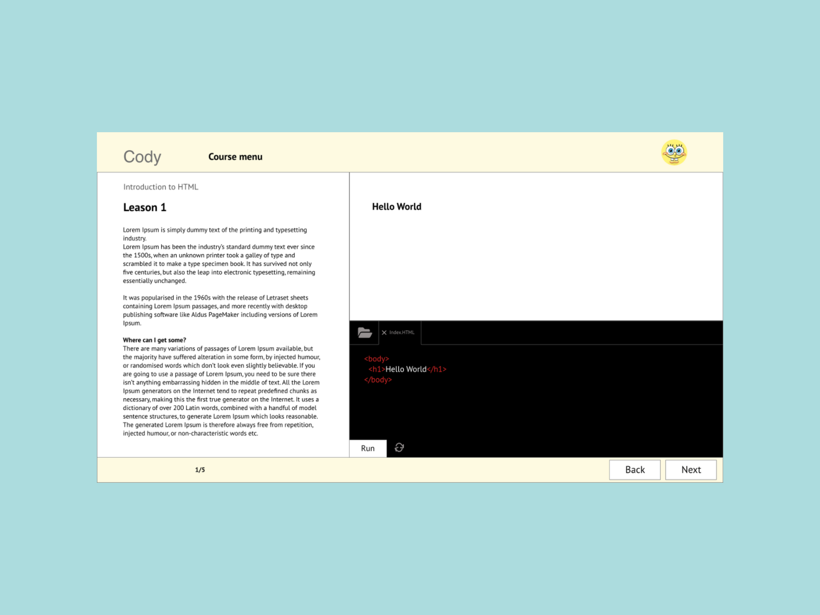
The final high-fidelity prototype presented cleaner user flows for logging in, choosing a course and start learning.
Accessibility considerations
1. I used headings with different sized text for clear visual hierarchy.
2. Provided access to users who are vision impaired through adding alt text to each page for screen readers.